Self-Serve Reporting
- B2B SaaS
- HR tech
- Web
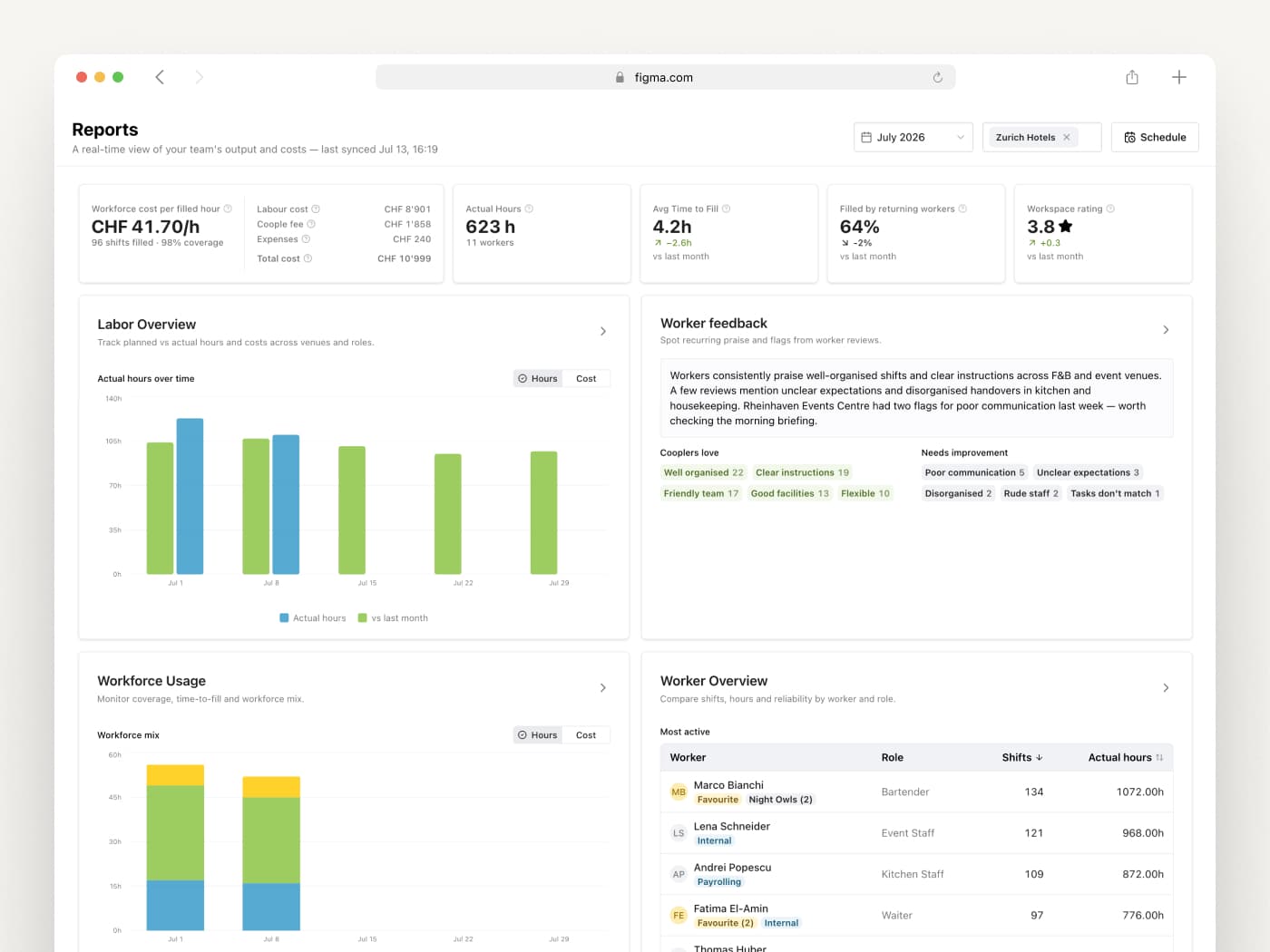
We replaced a manual CSV export workflow with a self-serve reporting hub.
I designed and led end-to-end as both PM and designer, prototyped with real components in Claude Code, and shipped with engineering support.
- Client
- Coople
- Role
- Senior Product Designer, Product Manager
- Duration
- 4 months
- Year
- 2026
- Team
- 2 members: full stack developer and me
Overview
Coople's Operations team was spending hours every week manually pulling data and rebuilding the same reports for enterprise clients. There was no central place for the recurring questions, and no way for clients to manage their own scheduling without going through ops.
I led this end-to-end, identifying the problem, writing the PRD, running discovery, and designing both the reporting hub and a scheduling feature.
To keep feedback loops tight, I prototyped key interactions using Claude Code with Coople's actual component library. Testing felt like the real product, and by the time we wrote a spec, the handoff was already component-aligned.
The result: four structured reports with consistent metric definitions, self-serve exports, and a scheduling feature that gave enterprise clients direct control over their workforce planning, for the first time.
- Reports shipped
- 4
- Ops time saved
- ~6h / week
- Enterprise adoption
- 100%
Labor, Feedback, Usage, Worker Overview
per enterprise account vs. manual CSV workflow
of pilot clients active in first month
Target audience
The hub isn't built for a single role. Workforce and Operations Managers use it day-to-day to track coverage, hours, and compliance across sites; Finance and HR pull it for cost variance and attendance trends; line managers check it for quick staffing answers; and executives skim it for high-level cost and risk summaries.
Discovery
I kicked off discovery with competitor research, using Claude to identify the strongest workforce management tools with reporting features, then investigated each product myself to understand what reports they offered and how detailed they were.
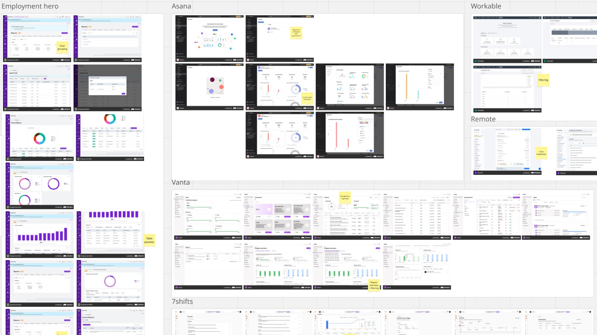
Competitor teardown, annotated reporting screens from workforce and adjacent tools, grouped by product.
That research also helped me prepare for sessions with our ops team, the people who were manually building and delivering these reports to clients. Rather than scheduling a meeting cold, I set up a dedicated Slack channel first, asking them to share which reports they thought we should prioritize and why. It gave people time to think, and meant the session itself was already warm.
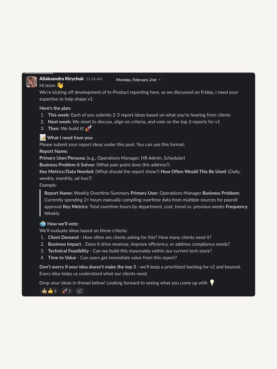
The kickoff post that primed the ops team.
From there I pulled everything into a Miro board: their ideas, my findings from competitor research, and insights from earlier interviews. We walked through it together, discussed, and voted. By the end we had a clear, shared picture of what the first version of reporting needed to cover.
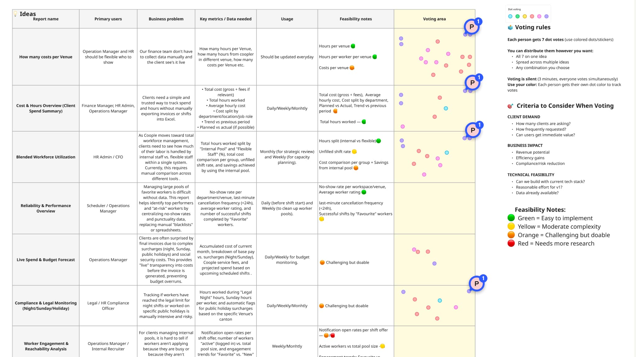
The Miro board we clustered and dot-voted on to lock the first version's scope.
The report ops wanted most wasn't right for clients
Challenge
The ops team's top priority was a Compliance report, but as we dug into it, it became clear it was better suited for internal use than client-facing reporting.
Solution
Rather than dropping it entirely, we opened the conversation up to a wider group to find an alternative. The replacement came quickly: a Worker Feedback report. Clients loved the idea.
Concepts and testing
After the first ops session, I put together an initial version of the reporting section. A static Figma prototype wasn't going to cut it: the behavior was too dependent on real data states to test meaningfully with mocked screens. I built a working version in Claude Code instead, and we made it shareable via link so other teams could test it without setup friction.
Before the next session, I recorded a walkthrough and posted it in the feedback channel. It gave the ops team time to form a first impression and come prepared, which made the conversation much more focused.
Based on their feedback, I updated the prototype and ran a second round of testing with the internal product team. They had plenty to say too, and I worked through their feedback before we considered it ready to put in front of clients.
Showing cost data without making it feel like an accusation
Challenge
In the first version, we included Total Cost as a top-level metric on the Reports Hub: transparency was the intent. But rising costs aren't a neutral number for clients; they're a signal that prompts questions about the value of the relationship.
Solution
We decided to keep the data visible, but reduced its prominence. Cost figures are still shown on the hub, just no longer as a headline metric.
Mockups and iterations
The final prototype we brought to client interviews centered on a Reports Hub, an entry page with a top-level KPI strip and preview cards for each report. The goal was to make it feel like a daily command center, not just a navigation menu. Each report follows the same structure: filters at the top, a KPI strip, charts for trend and pattern recognition, and a drilldown table for the detail work. Every report can be exported or scheduled for automatic delivery (daily, weekly, or monthly) in PDF, XLSX, or CSV.
The hub covers four reports:
Labor Overview tracks planned vs. actual hours and costs across venues and roles. Clients can see where hours are running over or under plan, how costs break down by labour, fees, and expenses, and drill into individual shifts, all the way from venue to role to worker.
Workforce Usage gives a clear picture of coverage, time-to-fill, and workforce mix. It shows how internal staff, Cooplers, and payrolling workers are distributed over time, where coverage gaps are appearing, and how quickly shifts are being filled, useful for spotting resourcing patterns before they become problems.
Worker Overview lets clients compare shifts, hours, attendance, and reliability across their workforce. It surfaces who the most active workers are, flags absences and no-shows, and gives a per-worker breakdown of actual vs. planned hours, handy for decisions about favourites and recurring bookings.
Worker Feedback surfaces recurring themes from worker reviews, AI-summarised into key takeaways. Clients can see what workers consistently praise, what needs attention, and filter by venue, role, or rating, turning qualitative signals into something actionable.
We ran interviews with five clients to gather feedback from a business perspective. We also shared the prototype link through team members who were already in regular contact with clients, which extended our reach without adding extra interview sessions. The feedback we got was substantial, and it led to significant rework of the initial design.
Permissions are more complex than they look
Challenge
Enterprise client users need different levels of data access depending on their role and location, not everyone should see cost data, for example.
Solution
This needs a dedicated permissions model, and it's already in our pipeline.
Tables that work for everyone tend to work well for no one
Challenge
Different teams and clients rely on different columns in the breakdown tables. When we added everything that was needed, the tables became too crowded to be useful.
Solution
For now, we added column management to each table so users can show and hide what's relevant to them, and their setup is saved across sessions. Down the road, we could take this further with role-based default views tailored to personas like Finance or Hiring Managers.
Adoption and next steps
A round of task-based testing with the ops team and two clients validated the final design. Refinements focused on the filter bar (made sticky on scroll with active filters always visible), along with several new charts and adjustments to the report scheduling flow for admin users.
We're actively collecting feedback and tracking adoption via Datadog.
Next, we're feeding that feedback into the roadmap: more reports, and a real push toward role-based views, tailored to Finance, HR, and line managers, so each persona lands on the metrics that matter most to them instead of one generic hub.